The digital space is evolving at a breakneck pace as we move through 2026. Browsers are more capable, coding frameworks are vastly optimized, and user expectations have completely shifted. Web design is no longer just about making things look clean or professional. Today, it is about creating deeply responsive, human centered digital environments that react in real time to individual needs. Staying updated on modern web design trends is crucial for brands that want to capture attention, reduce bounce rates, and offer unforgettable user journeys.
In 2026, internet layouts are transitioning from rigid, static structures into highly fluid systems. Driven by breakthrough technologies, websites now behave like interactive living platforms rather than electronic brochures. Let us explore the groundbreaking styles and functional advancements that are setting the new standard for our screens this year.
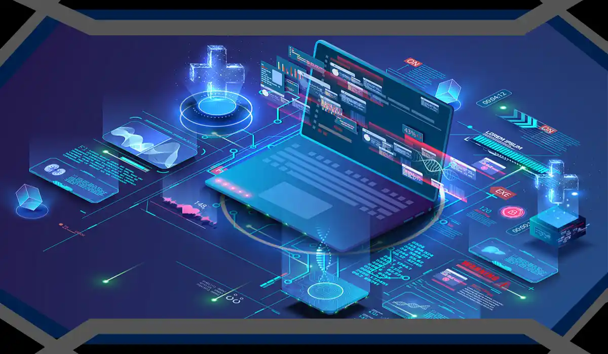
Web Design Trends Reshaping Our Interfaces
The foundational architecture of modern websites is undergoing a major creative rebellion. Designers are casting aside identical template structures to build unique, dynamic digital worlds.
Generative UI and Contextual Layouts
Generative User Interface represents one of the most significant leaps in the history of layout design. Instead of presenting a fixed page to every visitor, websites now build themselves on the fly based on real time data.
When a user lands on a platform, the site instantly evaluates their intent, past browsing habits, and physical location. If a person requires dense data, the interface automatically shifts into a neat grid with expanded tables. If another visitor seeks inspiration, the exact same URL morphs into an immersive media gallery. This highly personalized approach removes digital friction, delivering content in the precise format a user desires.
Tactile Maximalism and Real Textures
While flat, ultra minimal corporate layouts dominated the past decade, 2026 is embracing tactile maximalism. This movement brings physical depth back to the flat glass of our devices.
Buttons, background panels, and cards now feature realistic textures resembling frosted glass, brushed metals, organic clay, or recycled paper. When you hover over or tap these elements, they react with realistic physics, displaying subtle bends, light reflections, or structural shifts. This creates a satisfying, sensory rich browsing environment that bridges the gap between the virtual and physical worlds.
The Infinite Canvas and Non Linear Journeys
Traditional websites force visitors down a predictable, strictly vertical path. Modern platforms break these boundaries by implementing an infinite canvas layout.
Instead of scrolling standard page lengths, users are encouraged to explore workspaces that expand freely in all directions. You might pan horizontally to view a product timeline, zoom deeply into a high resolution graphic, or navigate diagonally through a narrative showcase. By utilizing smart guided scrolling indicators, designers ensure that users remain oriented and seamlessly find primary call to action zones while retaining total freedom of movement.
Elevating Visual Storytelling Through Motion
Movement on the modern web is no longer a distracting addition used to fill empty space. It has evolved into an essential narrative tool that helps explain complex ideas at a glance.
Kinetic Typography and Expressive Copy
Words are increasingly acting as central visual assets themselves. Kinetic typography ensures that headlines and descriptive copy react directly to the way a user interacts with the screen.
Text blocks now grow bolder as you scroll, stretch horizontally to emphasize specific points, or fluidly disperse like liquid particles around a mouse cursor. This treatment turns standard reading into an active, theatrical event. It commands visual attention, dramatically increasing time spent on a page while making marketing statements resonate deeply.
Ultra Lightweight WebGL and Immersive 3D
Integrating 3D objects used to be notorious for destroying site speeds and ruining search engine optimization. Thanks to widespread optimization frameworks, interactive 3D is a standard element of modern layout building.
E-commerce platforms now routinely feature interactive 3D item models that visitors can open, rotate, and view from any angle without a single microsecond of lag. By utilizing highly optimized WebGL code, these elements consume minimal data, allowing websites to retain lightning fast loading speeds while providing premium, tactile product presentations.
Prioritizing Inclusivity and Human Centered Experiences
True innovation must prioritize usability. Modern accessibility goes far beyond simple legal checkmarks, integrating directly into the creative fabric of the screen.
Multi Modal Inputs
The way humans talk to computers is changing, and platforms are adjusting accordingly. Sites increasingly support multi modal inputs, allowing people to navigate using touch, voice commands, gestures, and mouse paths simultaneously. A visitor can view an online catalog, point at an item, and speak a command to add it to their cart. This flexibility ensures a seamless browsing experience for users of all physical abilities.
Progressive Disclosure and Cognitive Calm
With digital overload at an all time high, creators are turning to progressive disclosure to bring peace back to the interface. This method displays only the most essential details upon first glance, hiding deeper technical specifications behind intuitive micro interactions.
UX Rule of Thumb: By keeping the initial screen uncluttered, you reduce cognitive fatigue, boost user comprehension, and allow visitors to uncover detailed layers of data entirely at their own comfortable pace.
Fusing Performance with Nostalgic and Artistic Styles
The aesthetic landscape of 2026 is marked by an exciting blend of technological power and artistic history. Brands are steering clear of safe corporate styling in favor of bold creative statements.
The Rise of Museumcore Aesthetics
A beautiful response to the tech heavy era is the emergence of Museumcore. This style treats web browsers like high end art galleries, relying on massive whitespace, historical archival photography, soft muted tones, and highly polished serif typefaces.
This layout style works perfectly for luxury retail, cultural institutions, and premium creative studios. It communicates quiet confidence, absolute authority, and an appreciation for meticulous craftsmanship without screaming for attention.
Adaptive Transparency and Liquid Glass
Interfaces are displaying incredible layering effects through adaptive transparency, a style often referred to as liquid glass. By using blurred background overlays and glowing colorful ambient lights behind structural cards, designers give screens an authentic sense of depth. This keeps content perfectly separated and easy to read while maintaining optimal contrast standards required for flawless readability.
Actionable Tips to Modernize Your Platform
Upgrading your online setup does not require a complete, overwhelming rebuild. Start with these targeted steps:
- Clean Up Information Overload: Introduce progressive disclosure on data heavy pages. Use clean dropdown menus or interactive tabs to hide deep text blocks until needed.
- Add Purposeful Motion: Introduce gentle kinetic typography to your main hero headlines. Ensure text changes smoothly as users scroll down the page.
- Optimize Interactive Elements: Elevate standard hover states. Give buttons a soft, elastic bounce or a slight change in texture when a user interacts with them.
- Keep Site Speeds Top Tier: If you incorporate 3D elements or physics based transitions, ensure they are thoroughly compressed to protect your search optimization metrics.
Focusing heavily on established user experience design practices guarantees your platform remains highly functional while adopting these fresh visual ideas.
Aligning these technical updates with a structured digitation strategy ensures that your development process remains smooth, predictable, and fully aligned with your broader operational benchmarks.
Cultivating Tomorrow’s Web Presence
The visual transformations dominating our screens this year show that web spaces are no longer just flat text files. They are intelligent, highly flexible ecosystems built around human behavior. By pairing generative user interfaces with engaging traits like kinetic typography and tactile maximalism, brands can build spaces that feel natural and highly rewarding to browse.
When refreshing your online presence, prioritize changes that provide real value, clarity, and delight to your audience. The ultimate goal is to remove friction while telling an impactful story. Embracing these core principles ensures your platform remains incredibly engaging, accessible, and prepared to thrive across every device for years to come.
Leave a Reply